Friday, May 15, 2009

Mood Boards

Mood Boards


I found these mood boards quite difficult, but very worth while. Having never done or heard of a mood board before, it was quite daunting being asked to produce 5 of them!
But after researching and talking with my tutor, i found this very helpful in developing my final assessment piece and deciding on a style to follow for it.
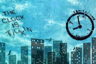
Basically my animation is going to have a underlying meaning, its basically sending the message that life is constantly getting shorter, and that living by the clock or in the clock is very stressful and intense. It's relating life and time as one. By doing this mood board assessment i was forced to visualise what i wanted my final piece of work to look like which helped me immensely.
I am also not a confident user of Photoshop but after doing this piece of assessment i have learnt a lot about the program, such as different brushes, blending modes, shadows etc. This is very pleasing to become a little more confident and knowledgeable about such a useful program.
In conclusion when ever i have a upcoming visual project due i will create mood boards to help me decide how i want the final piece to look, i think there well worth the time.


Wednesday, May 13, 2009

Week 7 '3D Composition'

This weeks Tutorial was more difficult than i originally thought. It also had a lot more steps in the proccess than i thought.

Firstly i found 2 photo's and took them into Photoshop. I cut out certain objects in the photo of the farm and turned them into their own layer, this way i could animate them separately. So for example i used the lasoo tool to cut out the barn, then cut out the wheat and the hills in the background etc. I found this quite time consuming, and if i was going to do this exercise again, i would choose simpler pictures.

After separating the objects in the picture, i used the clone tool to extend the images, to fill in some of the transparency which resulted in cutting out objects in the picture.

Once i was finished I then loaded the photo shop file into After Effects as a composition, this way i could animate the individual layers how i wanted, and change there position individually.

I changed each layers z positioning to give the illusion of depth in the composition.

I then followed the techniques from the 3D Composition video that Chris had a up loaded on Blackboard and imported a camera into the composition to create the 3D effect.

After key framing the camera's movement and position, i masked out the plane from my second picture and added it to the main composition and gave it the illusion of flying infront of the mountains.

The things i like about my composition is the constant movement off the camera, i like how it's taking the viewer through the composition and makes the viewer feel part of the composition instead of an outside looking in.

The things i dont like about the final composition are as follows.

1. Im not satisfied with the quality of cloning i did in photoshop, im not very familiar with photoshop, and i feel that my cloning was average, if i was going to do this exercise again i would look up on the internet cloning techniques in photoshop to make it look more realistic.


2. I think that i may have rotated the camera a little bit too much when focusing on the plan at the end, the angles are so tight that it make the composition look much more un-realistic. If i was going to do this again, i would do more cloning and make the background image larger so that it would be easier to rotate the camera's point of view, and i would also have the camera further back from the subject to make it even more realistic.


In Conclusion i learned a lot about 3D compositioning in After Effects, but i also learned a lot about the photoshop program, and am excited to now know a few techniques which i will be able to use in my final assignment.


Tuesday, May 12, 2009

Week 8 'Tracking'


I found this weeks tutorial very frustrating! for me i found the tracker tool not very reliable, maybe on better footage or if i had more practice with the effect i would have been able to do better but what i ended up with was average.

Having said that, with the computer screen replacement i found that the final outcome was not that bad, infact i thought it looked quite good, but it took a while, Chris was right when he said its very tedious work. I basically did the trackers job and went through frame by frame, moving the tracker points to their correct postion with in the computer screen.

Seeing as the computer itself was a apple computer, i thought it would be only logical to have a apple symbol on the screen. I played with the levels and blending options for the apple layer and finished with a quite realistic outcome.

Thing i dont like about the final piece is that even though i masked and feathered the apple image to make it look more real, you can still notice little jumps which the image does with in the screen. If i was to do this again i would spend more time on the tracking points and make sure they are in the same place all the way throuhg.

in conclusion i think that the tracker tool is very usefull, IF you have correct footage to use it on, but this exercise was still very effective.


For this part of the exercise im sorry to say i kind of gave up on. I tried multiple times to stop my name from looking obviously out of place but i was un successfull.

There isn't a lot i like about this outcome. For some reason my name seems to just jump out of place every 3-4 frames. I applied motion blur and even began going through moving the text frame by frame but the text continued to jump back.

If i was going to do this exercise again i would spend more time on the key frames of the text, possibly go through the entire comp and change the keyframe positions one by one. I would also apply a different motion blur effect to make it look more realistic.

In conclusion i feel i didn't successfully attatch the text to the footage but i learnt a lot more about the tracking tool, such as the different track types and other option etc.

Thursday, May 7, 2009

Influences

There are many different types of animation which i have discovered through out this unit but one type of animation seems to still be my favorite. I have examples here to show. Its the cartoon looking Animation, it's similar to the Sin City look in a way how ever not so dark and sinister. It very much incorporates stencil look, just having the black and whites of the image and removing the grey. Having said that i like how bright colour shows up so well on these animations against the black and white.

These are my examples.

Influence no. 1

Rock n Rolla

http://www.dannyyount.com/movies/qt_rocknrolla.html

This is the opening credits from Guy Ritchie's latest film 'Rock 'n' Rolla', it was animated by Danny Yount, Ilya Abulhanov, Alex Hanson and Chris Sanchez. I love these opening credits, its this cartoon style animation which i would love to learn. I really like the constant moving of the camera and how it is never still, its always jerky. I like how it is fast paced and constantly moving through the scene, in and out of buildings, constantly revealing more to the viewer.

I like in the shot where we see Thandie Newtons character being introduced, how the background is as if its being painted while we are watching. Not only do i like the colours used in this animation, but i like the motion blur and grain that has been added to them, it really goes well with the audio, i gritty, hard, rock n roll sound. For me this whole composition is great and very effective. This animation has influenced me a lot and i would like to use some of the same techniques it uses in my assignment, such as the cartoon look. grain look and constantly moving.


Influence no. 2

Catch me if you can

http://www.youtube.com/watch?v=gaLDyrun_Cc

This animation is once again opening credits from a film, the film 'Catch me if you Can' directed by Steven Speilberg. It was animated by Olivier Kuntzel and Florence Deygas and i have liked this animation since i first saw the movie several years ago. The things i like most about this peice of work is the strong connection it has with the audio, i like the way that the images and scene changes when tthe tempo or rythem changes in the music. I like the use of simple shapes through out the peice and how even though there just rectangles filled with black we can instantly see that they are a flight of stairs or a street sign etc.

The use of black in this is probably what i like, and how its always revealing bits and peices of the story which lies ahead for the viewer. It reminds me of a performance of shadows puppets from the use of black in it. I would like to have the same connection between imagery and audio in my animation.

Influence no. 3

Duck and Cover

This animation, which was given to me for my unit, is very cool and it has a lot of techniques which i like. Even though this was made with Flash i am still influenced by it and wish to repliucate some of the same imagery in my assignment. The thing i like about itt is not only it's cool animation, but its perfect imagery and how everything is part of something else, such as the part where the symbols for the defence system's animate into thier correct location.

Its the attention to detail i like about this animation, i like how i have watched this several times and still continue to spot things that i didn't notice before, it's the little details in this animation that intreague me the most.

Its difficult for me to explain what i like most about this animation because i find it entertaining as a whole, is just visualy appealing to me and one day i would like to learn how to do a similar animation myself.


Influence no. 4

Passion Pit

http://www.motiongraphics.it/2009/05/07/passion-pit-the-reeling/

This Animation is very cool and follows similar traits from the first 3 examples i have shown but uses them in a differnt way. The things i like about this animation is it's faced paced, similar to tthe Rock n Roller opening credits, how ever its not cartoon like, its more like a collage effect, a look that i find very intreaguing and cool. Once again the thing i like about this is its revealing efffect, just like the other 3 animation's have, how its continuely pulling back layers and revealing more and more, making the viewer want to see more and more.

I like how it has a similar grainy look to the Rock n Roller clip, i find this very cool and plan on using it in my assignment. It also has a nice up beat tempo which i like, the bouncing of the music and the bouncing of the lady running on the street really compliment each other.

Influence no. 4

Bumped

http://motionographer.com/theater/weareseventeen-bumped/

Now To me this animation is simply visually fantastic. It incorporates all the things i like in an animation.

I like the vibrant colour's it has and how up beat it is.

I like the movement which it has, how it spins in and out from one scene to another.

I also like how the audio changes through out the animation, for example when its changing to a new scene, the audio becomes quite muffled, like the what you would hear from the outside of a club, but when we are taken fully into the scene, its very clear and loud.

The only thing i dont really like about this animation is that it doesn't go for longer, its so appealing that i want to keep watching.


Week 3 'The Rant'


This weeks tutorial i found tedious yet worth while none the less. It really drilled into me the art of matching the visual's with the audio in a composition. Even though this exercise was fairly straight forward i found it the most difficult due to its repetitive nature.

After first hearing the audio, i imediately knew that there was going to be a lot off key frame work ahead of me, and i was correct. Through out the entire composition i was constantly tweaking keyframes poitions to have the effects match up perfectly to the audio. Towards the end i was having trouble coming up with new exciting ways to animate each phrase while it was on the screen, which was good because it forced me to look through the text effects and find new effects that i had never even thought of, effects that would be great for my final assignment such as the typwriter effect or ripple dissolve.

As frustrating as the audio is i like the effect that it has on the visuals, i very much like the rant styled audio and would like to use something of the same nature for my 1 - 2 minute animation.

If i were to do this exrcise again i think i would put more effort into the fonts and colours of the words, i feel that the compostion i created lacks a certain exciting quality and that would make the viewer want to see more. I would most likely focus on the main key words instead of including little insignificant words like 'it' and 'was' due to the fact that they aren't needed, and this would make it somewhat easier to animate.

Over all this exercise taught me the importants of keyframes but mainly audio with imagery, and how audio add's a whole other level to a composition, making it more interesting and enjoyable for the viewer.


Week 6 Physical Grafffiti

This weeks tutorial was very beneficial to me because it taught me technique's which i would very much like to use in my final assignment. The graffiti look, in my mind, is very cool, and now i know how to apply the techniques and tamper with curves etc, i feel it opens up more doors for me motion graphic wise.

Having said that, for the me, creating the Sin City look was very difficult, and i feel that even after much time spent adjusting the curves and levels of this image, i still did not get my desired effect. I Took an image of a man and de-saturated it completely, i was kind of looking for a Max Payne kind of look, a serious man with a long trench coat in an alley way. I went onto the tutorial seeker site and followed all the steps in getting the Sin City effect, how ever was not successful.

The things that i would change in my image if i could would be:

  1. Making the man's coat more clear, but still maintaining the same hue and saturation on the rest of the wall, i think that it is too saturated on the jacket.
  2. I would attempt to make the rain more obvious because at the moment it just looks like marks on the brick, it lacks depth to be able to see that it is rain.
  3. I most likely would choose a different picture, one where the subject wasn't leaning against a wall, one where the subject had space between them and there background.

Having said what i don't like about the image, i must say i like the coloured graffiti on either sides of the subject, i think that the bright colours are a great contrast to the black and white suroundings, and really adds something to the over all image.

In conclusion, i really enjoyed this exercise, with a bit more practice im sure i will be able to get the proper sin City look, and i look forward to using these techniques for my final assignment.


For the second part of this weeks exercise i found it quite straight forward, just practice with curves, levels and stencil Work.

For this exercise i used the graffiti pictures of the mans face, the monopoly man and the rat holing the sign. When adjusting the curves for the monopoly man and the rat i had trouble Stenciling the subject in with out getting some grainy stuff from the image as well, how ever after adjusting the curves, as well as the level effect i managed to have a pretty clear stencil.

While i was making this temporal composition, for some reason i had the idea of the images being somewhat mysterious. so instead of just wiping the images on and off, i used the ripple effect to give a more mysterious feeling to the whole narrative of the animation. To get this effect, i animated the key frames for the ripple effect, as well as the opacity and scale.

In conclusion the end result is pretty straight forward, a series of stencils transitioning in and out on a concrete wall, If i was going to do this exercise again i would probably have more than one image in view at a time and possibly a different way of transitioning between the different images. This exercise was very good practice at stenciling and i plan to use this technique in my final assesment.